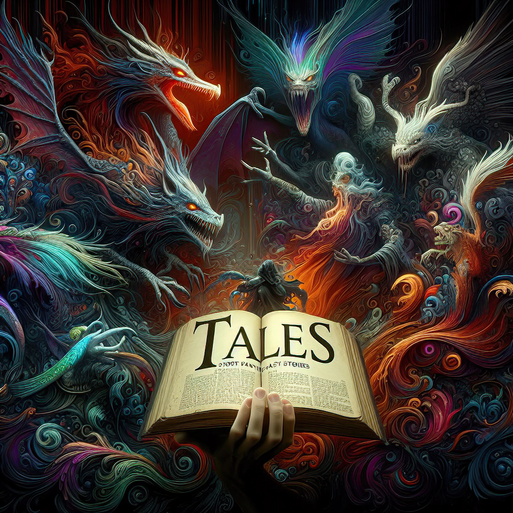

Creative Chronicles: Mastering Visuals and Words – by Bill Tiepelman
Mastering the Craft: Essential Design Principles
Hey there, future design mavericks! Welcome to our no-snooze zone, where we dive deep into the pulsating heart of creativity - the essential design principles. Before you roll your eyes and mutter, "Not another pretentious art lecture," let me assure you, this isn't your grandma's guide to design. Oh no, we're about to embark on a rollercoaster ride through the twists and turns of design elements, and trust me, it's more exhilarating than finding a forgotten chocolate bar in your fridge at 3 AM. Ever seen a design that made your eyes water, and not in a good way? We've all been there. That's the chaos we're here to avoid. So, buckle up, buttercup. We're about to make sense of the madness and turn you into the design guru your friends secretly envy. 1. Balance: The Art of Equilibrium Picture this: you're on a seesaw, enjoying the ups and downs, feeling like the ruler of the playground. That's balance, my friend, but in the design world, we don't need a playground – we create our own equilibrium. Balance is the silent guardian that ensures your design doesn't tip over into the land of "What were they thinking?" There are three amigos of balance: symmetrical (the twins), asymmetrical (the fraternal twins), and radial (the cool cousin). Symmetrical balance is like a calm reflection in a lake – equal, serene, boring... I mean, classic! Asymmetrical balance, on the other hand, is the life of the party, offering an unexpected twist while keeping things orderly. Radial? Imagine a spiral staircase from those fancy movies – everything revolves around a central point, creating a sense of movement. Here's a pro tip: to master the art of balance, play with different elements. Mix colors, textures, and sizes, and remember, what works for your friend’s Tinder profile picture might not work in design. And if you ever feel lost, just think of that seesaw - keep things even, but don't be afraid to jump off once in a while. 2. Contrast: More Than Just Black and White Ah, contrast, the drama queen of design. It’s what makes your creation pop, sizzle, and snap like a firecracker in a silent room. Without contrast, designs blend into the background like a chameleon on a kaleidoscope – interesting but hopelessly confused. Contrast isn’t just about slapping black next to white and calling it a day. It's about making elements stand out using colors, sizes, and textures. Imagine wearing neon socks with a tuxedo – that's contrast (and a bold fashion statement). Want to keep your viewers from snoozing? Throw in some contrast, but remember, like a strong perfume, a little goes a long way. Here’s some cheeky advice: avoid creating a design that's as exciting as watching paint dry. Mix things up! If your design were a party, contrast is the unexpected guest who turns a dull gathering into an unforgettable night. 3. Alignment: Order Out of Chaos Now, let's talk about alignment, the unsung hero of design. It's the invisible line that brings order to chaos, turning a wild jumble of elements into a sleek, coherent masterpiece. Think of it as the traffic light of design – without it, everything crashes into a hot mess. There are several types of alignment: edge, center, and axial. But don't get bogged down by the jargon. Simply put, alignment is about creating a clear path for the eye to follow. It's like arranging books on a shelf – there's a method to the madness. Avoid the "disorganized artistry" trap. Just because you can place elements willy-nilly doesn't mean you should. A well-aligned design is like a well-organized closet: it brings joy and makes life easier. And who doesn't want that? There you have it, the first part of our epic journey through the wonderland of design principles. By now, you should have a good grasp of balance, contrast, and alignment – the holy trinity that will elevate your work from "meh" to "wow." But don't stop here! Like any good sitcom, there's more to come. Stay tuned for our next installment, where we'll explore the mysteries of repetition, proximity, harmony, and emphasis. Until then, experiment, have fun, and remember, in the world of design, rules are more like guidelines. So go ahead, break them with a cheeky grin. See you on the flip side!