Creative Chronicles: Mastering Visuals and Words – by Bill Tiepelman
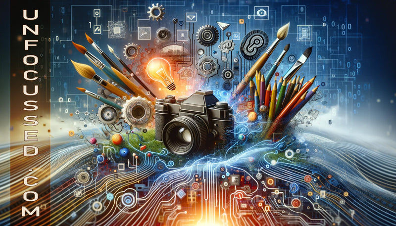
The Synergy of Words and Visuals
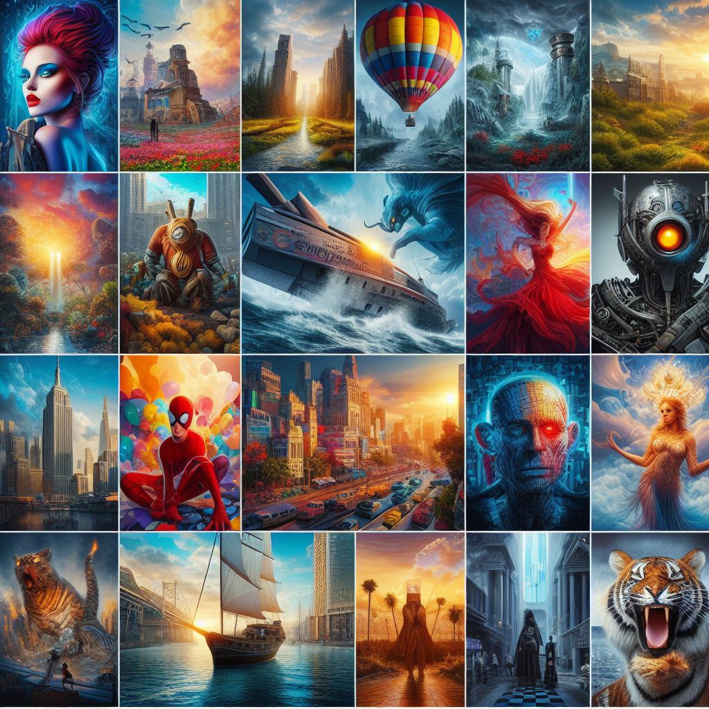
In our increasingly digital world, the fusion of words and visuals has never been more crucial. This synergy, when harnessed correctly, can elevate storytelling to new heights, making messages more compelling, memorable, and impactful. While visuals capture attention, words add depth and context, creating a powerful combination that can communicate complex ideas with clarity and emotion. This blog post delves into the art and science of blending written content with imagery, exploring how the right words can complement your visuals and transform your storytelling. Whether you're a marketer, artist, educator, or anyone in between, understanding how to effectively combine these elements can significantly enhance your communication strategy and engage your audience on a deeper level.
The Importance of Visuals in Communication
Humans are visual creatures by nature; our brains are wired to process images faster and more effectively than text alone. This innate ability underlines the importance of visuals in communication, serving not only to grab our attention but also to enhance our understanding and retention of information. In fact, studies suggest that people remember 80% of what they see and do, compared to only 20% of what they read.
Emotional Impact
Visuals have the power to evoke emotions and create a more profound connection with the audience. A compelling image can inspire, provoke thought, or even evoke nostalgia, driving the message home more effectively than words alone. This emotional engagement is crucial in storytelling, advertising, and branding, where the goal is often to create a lasting impression.
Comprehension and Retention
Visual aids, such as infographics, diagrams, and charts, can help simplify complex information, making it more accessible and easier to understand. By breaking down data and concepts into visual formats, audiences can grasp and retain information more effectively, which is particularly useful in educational and instructional content.
Cultural Relevance
Images can transcend language barriers, making them an essential tool in global communication. A well-chosen visual can convey a message universally, reaching a wider audience and fostering a more inclusive conversation.
Enhancing Brand Identity
Visually consistent branding helps in establishing a brand’s identity and values. Color schemes, logos, and design styles become synonymous with the brand, creating a visual shorthand that communicates more than words can convey on their own.
In summary, visuals are a crucial component of effective communication. They not only enhance the aesthetic appeal of content but also play a significant role in how information is processed, understood, and remembered.
The Power of Words
While visuals catch the eye, words engage the mind, providing the context, emotion, and depth that visuals alone cannot convey. The right choice of words can turn a static image into a story, transforming an ordinary message into a compelling narrative that resonates with the audience on a deeper level.
Narrative and Context
Words have the unique ability to weave context around an image, guiding the viewer’s interpretation and filling in the gaps left by visuals. A picture may be worth a thousand words, but without the right narrative, its message can be lost, misinterpreted, or underappreciated. Words anchor the visuals, ensuring that the message is clear, comprehensive, and impactful.
Emotional Connection
Language has the power to evoke emotions and connect with the audience on a personal level. Through storytelling, descriptive language, and tone, words can complement the emotions elicited by visuals, enhancing the overall impact of the message. This emotional resonance is what makes content memorable and engaging.
Persuasion and Influence
Words are the tools of persuasion. They can argue a point, highlight benefits, and persuade audiences to take action. When combined with persuasive imagery, the power of language is amplified, making the message more convincing and motivating.
SEO and Online Visibility
In the digital realm, words play a crucial role in search engine optimization (SEO). Well-crafted text, combined with relevant visuals, can improve a website's ranking, making it more visible and accessible to a larger audience. The strategic use of keywords, headings, and meta descriptions, in harmony with visual elements, can significantly enhance online presence and audience engagement.
In essence, words provide the narrative and emotional depth that turn mere images into powerful vehicles of communication. They shape perceptions, influence decisions, and create a connection that visuals alone cannot achieve.
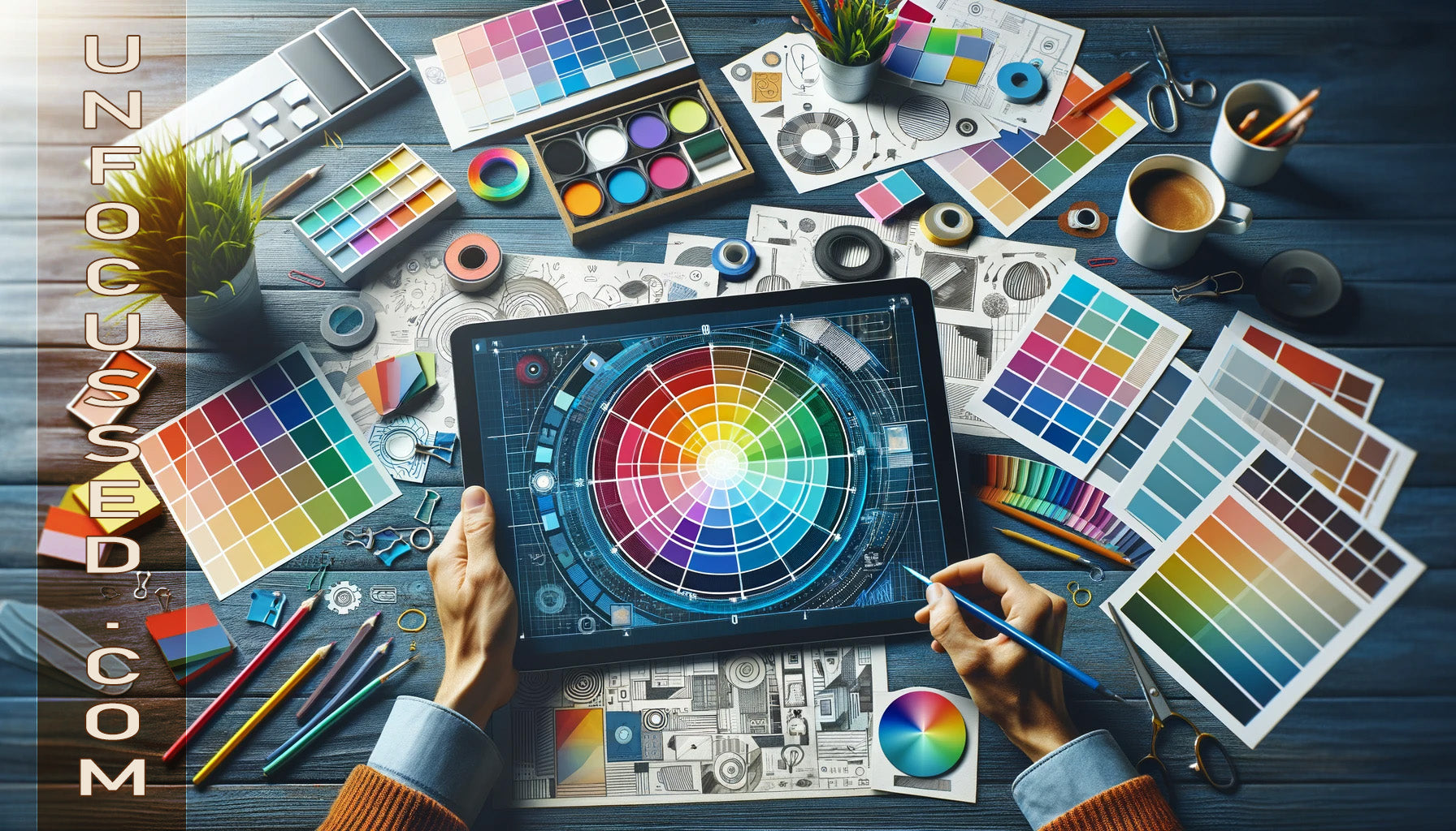
Integrating Words and Visuals
Creating a harmonious blend of text and image is an art that can significantly amplify the effectiveness of your message. When done correctly, this integration can capture the audience's attention, enhance their understanding, and leave a lasting impression. Below are techniques and considerations for successfully merging words with visuals.
Complementary Content
The key to successful integration is ensuring that the words and visuals complement each other. The text should enhance the visual, adding context or providing an emotional layer, while the visual should illustrate or reinforce the text. This mutual enhancement leads to a more cohesive and engaging message.
Balance and Layout
Finding the right balance between text and image is essential. Too much text can overwhelm the visual impact, while too little can leave the visuals without context. The layout should guide the viewer’s eye smoothly from text to image, creating a seamless narrative flow. Using design principles such as alignment, contrast, and hierarchy can help achieve this balance.
Consistency and Branding
Maintaining a consistent style and tone between the text and visuals strengthens your message and brand identity. This consistency should reflect in the color schemes, fonts, and imagery styles, ensuring that all elements align with the overall brand message and aesthetic.
Case Studies and Examples
Analyzing successful examples can provide valuable insights into effective integration. Marketing campaigns, infographics, and social media posts often display exemplary blends of text and image. Studying these can inspire techniques and approaches suitable for your own content.
Captions and Annotations
Using captions and annotations can directly link the text to specific parts of an image, making the connection explicit and guiding the viewer’s understanding. This technique is particularly effective in educational content, where detailed explanation of visual elements is required.
Integrating words and visuals is not a one-size-fits-all approach; it requires experimentation and adaptation to the specific context and audience. However, by employing these techniques and maintaining a focus on cohesive, complementary content, creators can craft messages that are not only visually appealing but also deeply resonant and impactful.
Practical Tips for Combining Text and Images
Blending text and images effectively requires more than just placing them side by side; it demands thoughtful consideration of each element's role and how they interact. Here are practical tips to ensure that your text and visuals complement each other perfectly:
Start with a Clear Objective: Before combining text and images, define the purpose of your content. Whether it’s to inform, persuade, entertain, or inspire, your objective should guide the selection and integration of both elements.
Choose Relevant Images: Select images that directly relate to your text. The visuals should support or expand upon the ideas presented in your words, creating a unified message that resonates with the viewer.
Maintain Visual Quality: High-quality, clear images are crucial. Blurry, pixelated, or irrelevant images can detract from the message and diminish the perceived value of your content.
Use Contrast and Space Wisely: Ensure there’s a good contrast between text and background to enhance readability. Utilize white space around text and images to prevent clutter and allow your message to breathe.
Match the Tone: Align the tone of your imagery with the tone of your text. A serious, informative article should not be paired with whimsical or unrelated images. The emotional tone of both text and visuals should complement each other.
Typography Matters: Choose fonts that are easy to read and fit the overall style of your content. Ensure that font size is appropriate for both headings and body text, maintaining a hierarchy that guides the reader through your content.
Test Layouts: Experiment with different layouts to find the most effective arrangement for your text and images. Consider the flow of information and how the eye is likely to move across the page.
Optimize for Different Platforms: Different platforms may require different formats or styles for optimal engagement. Ensure your text and images are optimized for the specific medium, whether it’s a blog, social media, or print.
Feedback is Key: Gather feedback from others to see how they interpret the combination of text and visuals. This can provide insights into how well your message is being conveyed and highlight areas for improvement.
By adhering to these practical tips, you can create a cohesive and engaging experience for your audience, where text and images work together to convey a clear and compelling message.
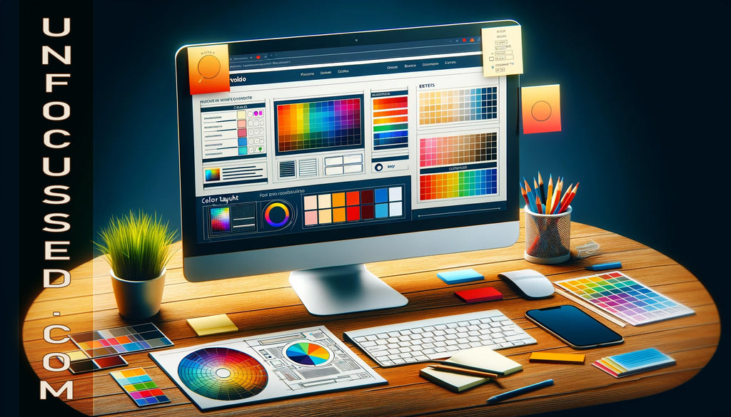
The Role of Technology and Tools
In today's digital age, a plethora of tools and technologies are available to help creators seamlessly integrate words and visuals. These tools not only streamline the creation process but also provide new opportunities for innovation and creativity. Here’s a look at how technology can aid in the fusion of text and image:
Graphic Design Software: Programs like Adobe Photoshop, Illustrator, and Canva offer extensive features for combining text and images. They provide a range of typography options, layout grids, and image editing capabilities that allow for precise control over the final composition.
Content Management Systems (CMS): Platforms like WordPress, Squarespace, and Wix enable users to easily integrate text and visuals into web content. They often come with built-in templates and drag-and-drop interfaces, making it simpler for non-designers to create professional-looking content.
Social Media Tools: Applications such as Canva, Adobe Spark, and PicMonkey are tailored for creating social media content, where the synergy of text and image is crucial. These tools offer templates and features specifically designed for the dimensions and formats preferred by different social media platforms.
Animation and Video Editing Software: With the rising popularity of video content, tools like Adobe After Effects and Final Cut Pro enable the combination of text, images, and motion, opening up new dimensions for storytelling and information sharing.
Data Visualization Tools: For content that involves data, tools like Tableau, Google Charts, and Infogram allow creators to convert complex data sets into compelling visuals, which can be further enhanced with descriptive text.
Mobile Apps: With the increasing use of smartphones for content creation, mobile apps like Snapseed, VSCO, and Adobe Lightroom provide powerful image editing features on-the-go, allowing creators to pair visuals with text directly from their phones.
It's important to choose the right tools based on your needs, skills, and the specific requirements of your content. By leveraging technology, creators can more effectively blend words and visuals, making their content more engaging, accessible, and impactful.
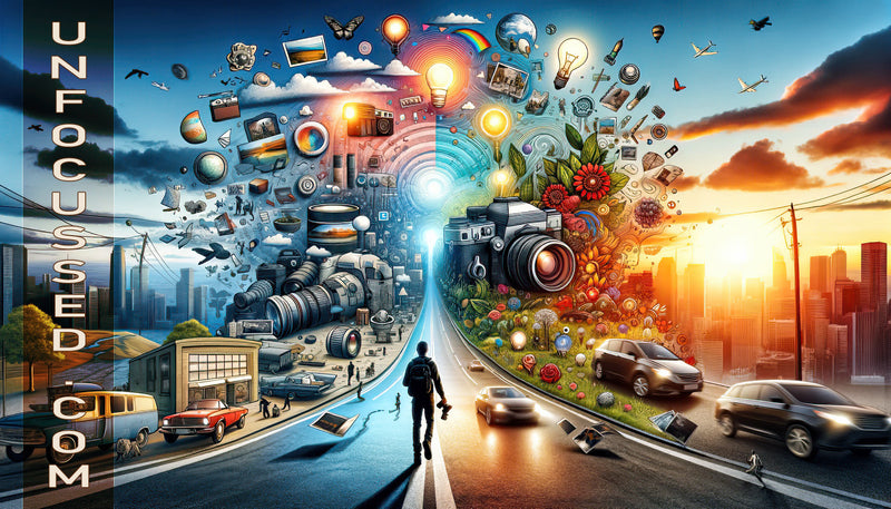
The synergy between words and visuals is more than just a design principle; it's a powerful storytelling tool that can significantly enhance communication and engagement. As we've explored, integrating text and imagery effectively requires understanding their individual strengths and how they can complement each other. Whether it's through evoking emotions, clarifying complex information, or enhancing memory retention, the combined force of words and visuals can transform the way we convey messages.
However, achieving this harmony is not always straightforward. It demands a thoughtful approach, considering factors such as relevance, balance, and consistency. By applying the practical tips and leveraging the right tools and technology, creators can craft content that captivates and resonates with their audience.
As we move forward in an increasingly visual and digital world, the importance of marrying text with image will only grow. Therefore, we encourage creators, marketers, educators, and communicators across all fields to experiment with and refine the integration of words and visuals. The results can lead to more impactful, memorable, and effective communication.
In closing, remember that the journey to mastering the synergy of words and visuals is ongoing. Stay curious, keep experimenting, and most importantly, enjoy the creative process of bringing your words and images together to tell compelling stories.